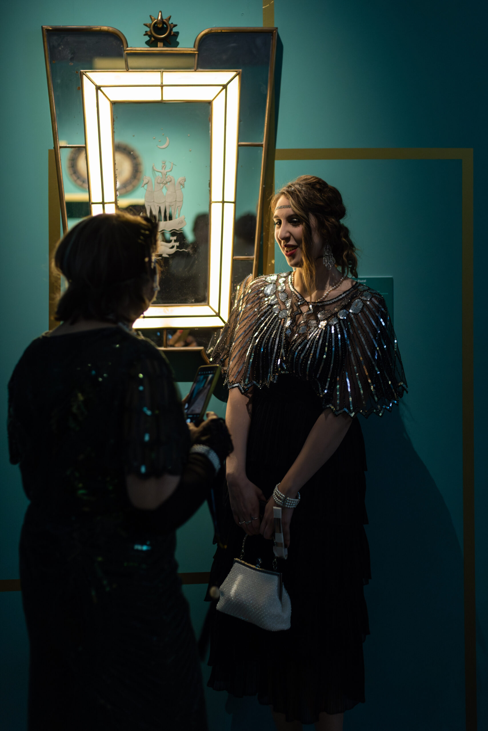
In the 1920s, when the Liberty style moved over for Art Deco, shapes and volumes were simplified, and decorations inspired by nature, overloaded with swirls and ornaments, gradually made way for more linear geometric patterns. Behind this change we can easily see the influence of early-century artistic avant-garde movements: Futurism and Cubism, breaking up figures into fragments, planes and volumes, then put back together in an attempt to overcome the limits imposed by the canvas, like units of time and unique points of view, as well as the Viennese Secession, charmed by the two-dimensionality and graphic abstraction of oriental arts.
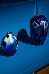
Ceramic artists also tapped into this new formal vocabulary, at times more aware than others, as shown by the beautiful works on display at the exhibition Art Déco. Il trionfo della modernità curated by Valerio Terraroli: the splendid oval vases decorated with rhomboid patterns by Camille Fauré, the “glaze master” of Limoges porcelain, who in the early Twenties abandoned garlands of flowers and leaves to embrace geometric patterns, rhombuses, herringbone and chevron; or, again, the vase with geometric decorations by the architect and designer Otto Prutscher, a leading member of the Viennese art scene in the first half of the 20th century.
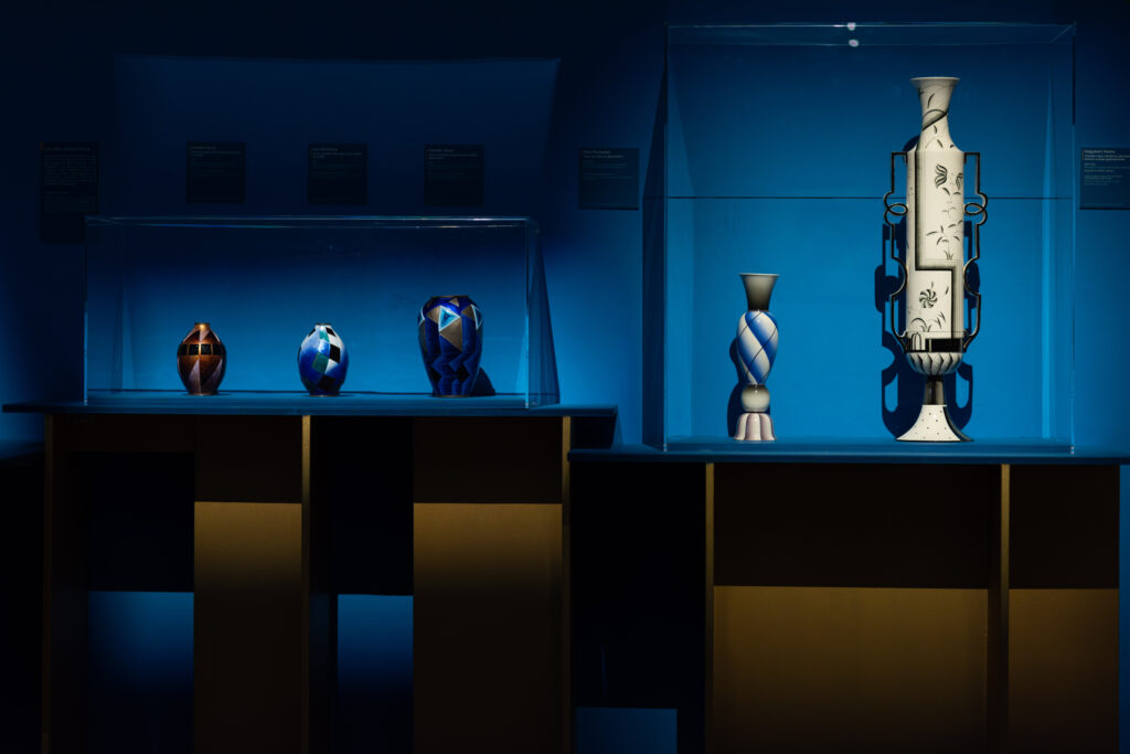
This vase in particular was painted using a spray gun – the forefather of spray cans, considered at the time to be the pinnacle of modernity – that allowed the artist to draw on ceramics by spraying the colour on in tiny drops, a much quicker and cheaper method compared to hand-painting with a brush; this is the demonstration of how technical developments also played a decisive role in the birth of a new decorative language. “Spray gun painting is first and foremost immediate,” Terraroli explains. “Then we can see how the shapes are very clean, due to the fact that this instrument cannot follow detailed decorations but can only work with linear and geometric graphic compositions.”
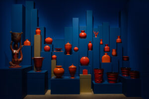
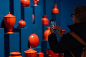
Simplification after simplification, we reach the last room of the exhibition. Here, we take a sudden leap forward in time, where all together like a group photo, twenty or so 1930s creamware vases and pots are displayed together, coated in vermilion glaze and created by some of the most talented artists of the time: Gio Ponti, Giovanni Gariboldi, who took over from him as art director at Richard-Ginori and won the first Compasso d’Oro in 1954 with the stackable dinnerware set Colonna, Guido Andlovitz and Angelo Biancini, both linked to the S.C.I. – Società Ceramica Italiana in Laveno. These are to all extents and purposes household objects, designed for everyday use and mass-produced in various shapes and sizes. Decorations disappeared, replaced by colour that stands out, while the simplified shapes were reduced to bare volumes, easy to mass produce.
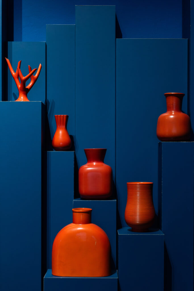
“We are at the cusp of decorative applied art and the birth of industrial design in Italy,” the design critic Domitilla Dardi states, placing this art in context while conversing with the curator Terraroli. “Towards the late Twenties the need arose to use a synthetic, intuitive language; there was no more time to waste in complex iconography or symbolic codes that the general public could not decipher. The focus therefore turned to something more immediate, such as colour.” Little time had passed since Gio Ponti had created the “Table Triumph” for the diplomatic offices of the Ministry of Foreign Affairs (porcelain, 1927-29, Richard Ginori), with its allegories alluding to moments in Italian history. The context had changed, and meanwhile sensitivity too changed profoundly: “Red is a powerful colour in the history of design, we may think for example of the Olivetti Valentine typewriter designed by Ettore Sottsass or “Ferrari red”. It is as if somehow in these works colour sums up all that complexity that in the past was narrated by ornamental and decorative patterns,” Dardi concludes.